Why we remember ‘Boost’ (health drink) in red color, why Facebook is always in blue, pink means girl’s color?? Do colors make any sense with us?? Yes they do, Colors can communicate different things with humans, they use human feelings to communicate its message and store it inside the human mind.
Why Colors in Marketing
“Color is the place where our brain and the universe meet.” Paul Klee
Color detains your attention, calm down or annoys the eyes, and send a powerful message to the viewers mind. The right color will made a business succeed and a wrong color can cause failure for a product or business. Color has an important role in everyone’s life, religion, nature, beliefs, and personality that all influence our purchase decision making.
Can you remember your favorite cartoon from these color combinations?
-
1. Red, Black and yellow – Mickey Mouse

-
2. Lime yellow, orange and blue – Tweety bird

-
3. Blue, yellow, red, white and orange – Donald duck

Color as a medium of communication
Why these characters are always memorable in human mind?? Importance of colors in explainer / animation video marketing starts here. In an explainer video, the color act as a medium of communication and it plays with human feelings. It converts purchase decisions of the customer and influences the ROI, also it represent a brand’s identity and personality.
Check the list of colors and it meanings below. It portraits the importance of color in an explainer video, because your video will engage and entertain your customer while it explains about you.
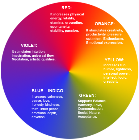
GREEN: Supports Balance, Harmony, Love, Communication, Social, Nature, Acceptance.
BLUE – INDIGO: Increases calmness, peace, love, honesty, kindness, truth, inner peace, emotional depth, devotion.
VIOLET: It stimulates intuition, imagination, universal flow, Meditation, artistic qualities.
RED: it increases physical energy, vitality, stamina, grounding, spontaneity, stability, passion.
ORANGE: it stimulates creativity, productivity, pleasure, optimism, Enthusiasm, Emotional expression.
YELLOW: increases fun, humor, lightness, personal power, intellect, logic, creativity.
In an explainer / animation video the virtual attraction of its landing page influences the viewer to click on that video link, and the above features will hook the viewers to pay attention the video.
It matters when you use colors in your explainer video
Key points you have to note down
Landing Page: When you use the colors wisely in your landing image of your Explainer video, the virtual attraction of the landing image will attract the viewer to click your video. Half of your marketing role will be done by the colors on your explainer video.
Customers: Use the colors in your Explainer video as per your target customers. If you are targeting women, use the variants of blue, purple, and green; they dislike the colors like orange brown and gray.
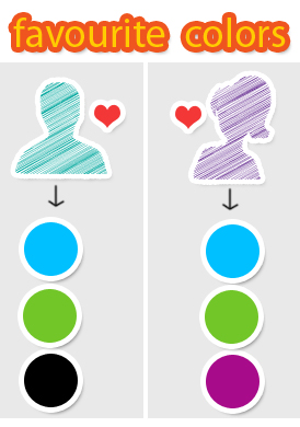
If your product is focusing mostly at men the game is entirely different. Men love Blue, Green, and black but avoid brown, orange and purple. These are the rules given by KISSmetrics researchers.
Feel: Wherever you use colors; think that you are going to play with the feel of your customers. When you are looking for getting attention for your explainer video, use a mix of warm and calm colors. Say, black and white, white will go with any of the dark and warm colors, but no cool colors like blue green n all.
For example: Nike animation advertisements. They have used red, black and gray colors in their advertisements; recently redbus.com has introduced their explainer video with gray, red and white colors. Their logo, redbus.com got a punching image in the viewers mind because of the logo color RED. Another visible example is the hyperlinks associated with the web contents, it’s in blue because its visibility and ability to strike the viewers notice.
Meaning of colors for using it with your explainer video
Here I am adding some of the colors and its features for your information. Use it wisely as per your business nature in your explainer video.
Red: It gives Energy, a sense of necessity, passion, desire, love, anger, violence, and danger. The contradicting factors are love and danger. Also it can actually increase heart rates, respiration, and metabolism. If you felt anxious while shopping, this might be the reason. This is one of the reason why people using this color for sign in or sign up button in a website.
Orange: The color of Joy, aggression, change, and it calls to action. In the emotional spectrum Orange falls somewhere between red and yellow. It is stronger than yellow but much friendly than red. Darker shades of orange can be associated with the autumn season and the earth. Most of the retail shoppers use this color for their logo and other banners to show that they are customer friendly.
Yellow: This shows Optimism, sunshine, hope, energy, and happiness. Yellow is a good color for adding cheerfulness to your site. But be careful while you overuse yellow in your channels can be hard on the eyes because sometimes it associated with weakness. Less yellow will gives you proper result, so use it wisely.
Blue: One of the cool colors; which indicates trust, security, calm, responsibility, friendliness. The color blue is often used by banks and businesses to create an atmosphere of trust and responsibility. The meaning behind blue will vary depending on its shade and hue more than some other colors. For example, darker blues denote more security while lighter blues are seen as more friendly.
Green: The color of nature; that symbolizes wealth, natural energy, renewal and the environment. Green is another color where the exact shade of green can drastically change the meaning behind it. There is a big difference between a green associated with wealth and a green associated with the environment. Green can also be associated with jealousy or envy. Again, this is a situation where context is important. Green is also the easiest color that attract virtual feel through the eyes.
Purple: A magnificent color that indicates royalty, creativity, wisdom, dignity, status. Lighter purples can also be associated with love and romance. It comes with strong and feminine brands like jewelry ads, cosmetic ads and websites, if your target market is ladies oriented and then use Purple.
Pink: The feminine color and it’s a color for Romance, love, calm, femininity, and friendship. Pink traditionally is associated with femininity and is seldom used in design to target men. Because of its calming effect, the color pink has been used to paint the locker rooms of opposing sports teams. Pink is a good example of how the meanings behind colors can shift. Today, many would associate pink with breast cancer awareness.
White: White has a positive connotation and can be used with just about any color. On its own, white can give off the feeling of emptiness. The combination of white with any dark color will attract human eyes and it stays in the memory. Nike has used this strategy for its logo and other branding strategies.
Black: the manly color and it indicates Power, elegance, prestige, and classiness. On the opposite end of the spectrum from white, black is another color that can be used with just about any other color. The combination of black with any of the cool color is an amazing combination for any visuals. But in some situation it indicates evil or negativity, it will click only of we use it properly.
Gold: It’s a secondary color of yellow that point out prestige, illumination, wealth, and expensive things. When used as a primary color in design, gold often takes on the properties of yellow. It also gives a warm and royal feel while it used with warm or medium colors.
Silver: Again it’s a color of prestige, cold and scientific. Silver is very similar to gold but it evokes a colder emotion rather than the happier, brighter feeling associated with gold. It works well when you use it with some masculine brands and images.
All the above descriptions are based upon different studies and personal perception of the people who work behind it. No one can predict the science behind the colors; it changes with situation, culture, region and so on. Understand your customer profile well before you color your explainer video, it may give a strong hit on your side as well as your client side.
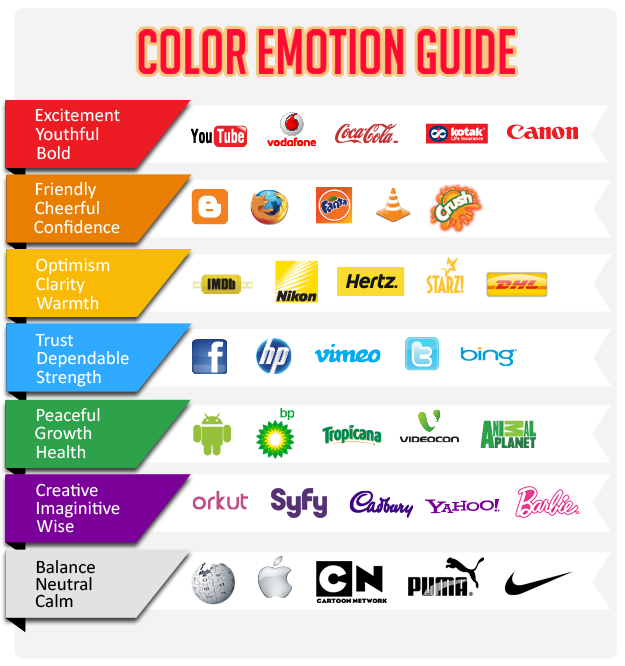
It has also been proven that color improves memory. In the case of brands, color has been shown to improve brand recognition by as much as 85 percent. This is a statistic that shouldn’t be ignored. So whether you are developing a website or building a brand, consider colors to deliver the appropriate theme.
The studies and researches proved that color improves memory. Color has used with brands to improve its recognition around 85 percent. Which is a statistics that cannot be ignored while making your explainer video, so whatever color you are using in your explainer video, make sure that the colors are delivering the correct message i.e. what your customer expects from you.

